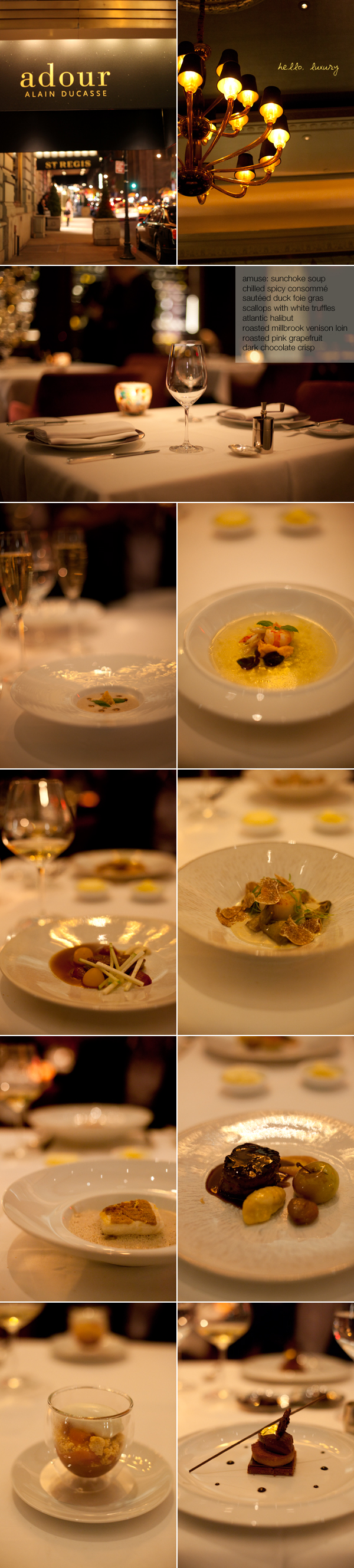
This post is less about the food than the two new things I'm trying out. One is pretty obvious - see the third picture in this layout. I was hoping to go for a more magazine-like feel (too much inspiration from all of the fantastic e-magazines circulating online right now). Whaddya think, thumbs up or thumbs down? I'd love to try more collage layout tinkering because it is just too easy to go with what I'm used to. At the same time, I don't want to fix what ain't broke. The other is that I shot the food pictures in RAW with hopes of achieving better white balance. I'm still not thrilled with my adjustments... how the hell does
ulterior epicure do it?!
I remember wanting to go to Adour a few years ago and having a heart attack at the caviar prices (though the white truffles we had as a supplement this time were no joke either). We went here as a bit of a pre-Thanksgiving feast on Wednesday night. The dining room is spacious and elegant and the food is confidently French. Everything was wonderful except perhaps the portions could have been sized down more. Dessert for the first time that I can remember was a struggle! This was a pity because both were greatly complex and exciting dishes. We also took home a very pretty box of macarons and chocolate truffles. :)
Hmm, I do like the tiny words on your photos like the second one, but I'm not really liking the word box in third one. It does give the magazine-like feel you wanted, but I don't like how it is covering up the picture. Your pictures are too good to be covered up!
ReplyDeleteWait, I need to stop drooling first...
ReplyDeleteOkay. It does look magazine-like, rather formal. I would not mind it if you did your usual "scribble" thingy, though. Like the whimsy.
White balance. Expodisc (shoot-through, expensive), coffee filter (shoot-through, ghetto, works like the Expodisc), grey card (target, old school). If you are using Camera Raw, the White Balance eyedropper is pretty neat. But also remember that, unless the viewer is also working through a color-calibrated monitor and using a browser with a known colorspace, you really don't know what they are seeing.
Nice work. Keep it going.
I want to see you at Les Halles!!! Please!!! =)
ReplyDeleteI think the box is too massive and it's cutting an edge of the picture so that it isn't balanced anymore.
ReplyDeleteThe cheapest way would be to use a simple (small) gray card. Take a photo of this card and use the manual white balance. You should get perfect white dish.
I agree... I like the whimsy scribbles! The box is nice, but it is distracting to the photograph.
ReplyDeleteWhat if you made a sort of diptych (not equal parts, of course) and put the text in just a lightly colored box, almost like a quote to the side of the image?
Just throwin' ideas out there. Whatever you do, your photos always end up lovely.
I agree with Jackie--your photos are too good to be covered up!!
ReplyDeleteI think it's always nice to change it up, although I am partial to the scribbles, which give a more informal, whimsical feel.
ReplyDeleteBtw, I always find that correcting for lighting is harder in post-processing, prob because I shoot in JPEG. (But even in RAW, it's not great!) So I always just manually correct for lighting before taking a shot indoors.
Really amazing pictures! One quick thing: can you include links to the restaurants that you mention in your posts?
ReplyDeletehey alice, for reducing the slight yellowing and making the dishes look poppingly white like that other website..in addition to cooling the temp a tad on the WB tab on lightroom, go to the HSL tab further down, bring down orange and yellow saturation. then modify exposure/brightness/highlights to bring out the color/whiteness a little bit.
ReplyDelete